Template: Vision 2020
Probably the FASTEST website template you will ever use
No HTML website template can (or even should) try to be all things for all people. if you load it with countless options, styles, classes etc then it becomes overwhelming, difficult to use and ends up appealing to no-one. Instead, it needs to be focused on a specific group of users, and have a clearly defined objective that will appeal to that group.
This template is focused on being lightweight, fast loading, and particularly useful for those that need to have plenty of images and lightbox galleries on display. A primary focus is also on page load speed, especially on mobile devices.
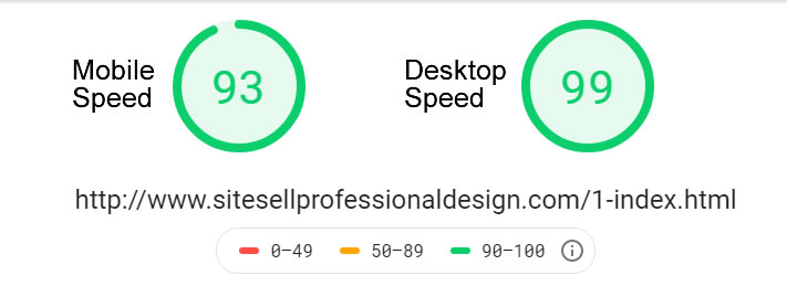
A fast loading website is a joy to use. Vision 2020 uses CSS3 and HTML5 to make sure your page loads as fast as possible, is well optimized for SEO and displays correctly across all devices (even older versions of IE). Images and videos are lazy loaded, scripts are chosen and created carefully, and everything is designed in such a way that HTTP requests are kept to a minimum. Result: a page that can get a score of 100/100 or close to it on pagespeed insights. Even this particular page loaded to the brim with large images, lightboxes, PINNIT buttons, custom search, social links etc will score in the mid-high 90's. But don't take my word for it, check it for yourself.
Just Some Of The Template Features...
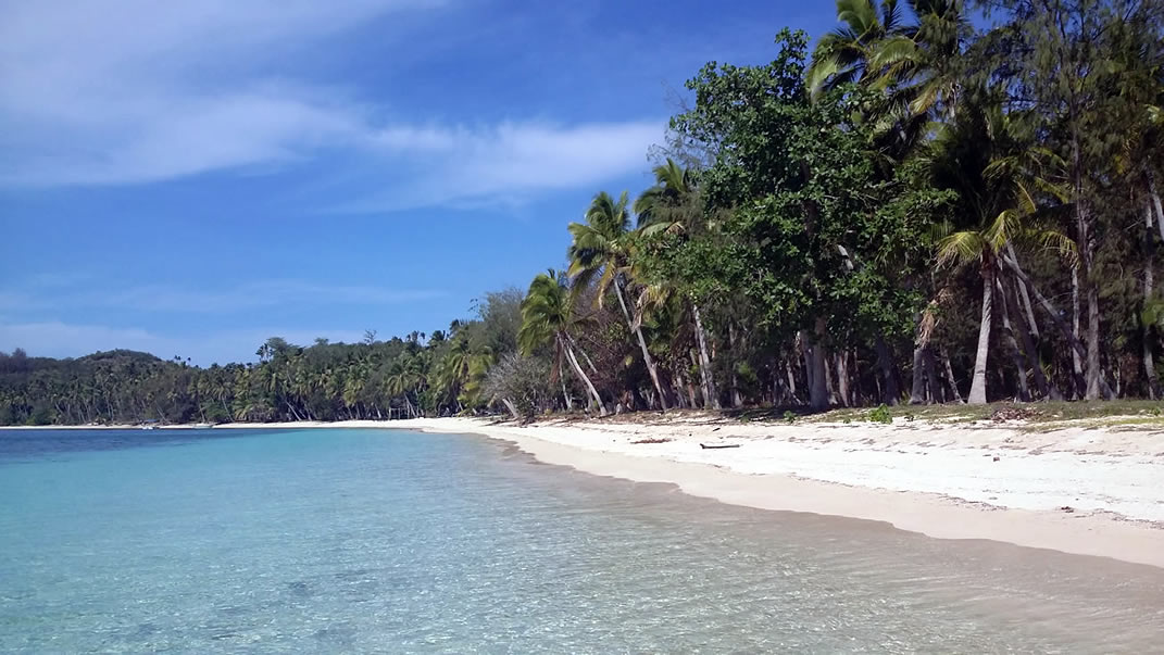
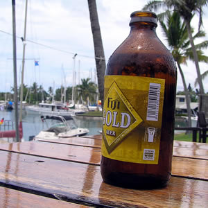
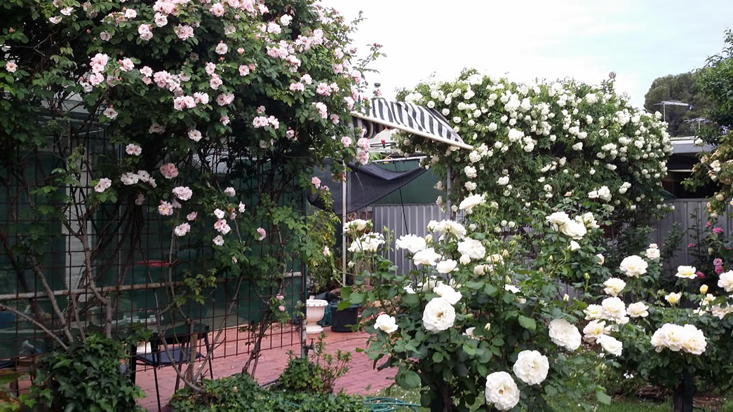
Example of Lazy Loaded Image: We use the figure tag to hold images, and figcaption for the captions. Choose between "normal" captions below the image or add the class of "overlap" to get the effect you see on the picture below. We can put wide images (1000px) on our page, which stretch past the text content width.
Just because we have a fast loading template, that doesn't mean we need to sacrifice looks and functionality. This comes with many of the features you want in a design...
- The Google search box has been styled
- Dropdown nav is fully responsive and looks great on any device
- Navbar is "sticky" in desktop view
- You can change the image for the list items (those blue dots)
- Images and videos are "Lazy Loaded"
- Automatic PIN IT for your images (you can turn off for images you don't want to be pinnable)
- Social sharing icons with additional styling
- Lightbox galleries (works in mobile too!)
- Print button which gives a perfect print layout on all devices
- Choose single or 2 column layouts. Mix and match these to your needs
- The extra (right) column will always display wide enough to meet MediaVine requirements
Print This Article Button
This really is a very cool feature with the template. There is a print button placed into an include, so you can leave it off pages that you don't want or expect to be printed. Look towards the bottom of this article and you will see a PRINT button.
Try it. The page should display nicely in print preview regardless of what device is being used. Chrome browser gives the best preview, but the print layout will be the same whatever device or browser you are using. Desktop, Laptop, iPhone, Android etc. The print function automatically selects the content to be printed, leaving out things such as the header, footer and side column (if you are using one).
Two Types Of Boxes
There are two types of boxes to use. The "callout" and the "reminder" The callout is a fullwidth box, styled however you like, good for showing some important content you don't want people to miss. You can combine text and images in the box with image either floated or centered.
Example of a callout box, that has a floated image with some text. Notice that the box is "self-clearing" so that the contents are fully contained within the border.
Floated images in the box are automatically constrained to be no more than 50% of the width.
Reminder Box
We would use a reminder box, if we had a snippet of content which wouldn't be a good fit for the general flow of the page. The styling for this uses the class of .reminder, and we can choose whether the container will be an <aside> or a <section>. The difference between these is explained below.
Reminder!
This is some text in the floated aside reminder box.
The font is slightly smaller, with less gap between paragraphs. Use this box as a way to jog peoples memory, or point out something they might find useful.
Different than the callout, this is floated to the right, and is intended for less important supplementary content. When to use a reminder box? Think about your article: if somebody was to print it out, would they really need to have the contents of your reminder box? If the answer is yes, then the content probably isn't suitable for this particular box. As the box is an <aside>, that means it does not appear in print view.
But what if you do want this reminder to be printed? That's easy. Instead of using the tag of <aside class="reminder">, just replace that with <section class="reminder">. Unlike an aside, sections will appear in print view. It also gives a hint to Search Engines that the content might be slightly more important than if it was in an aside.
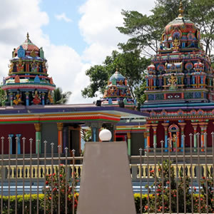
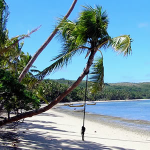
Example of a Gallery That Links To Other Pages
The images are just as an example, they aren't actually linked to any webpages. But you can see how a gallery like this can be useful as a "related pages" type feature. Galleries are not just for lightboxes.
Demo 1
Demo 2
Demo 3
Demo 4
Demo 5

Demo 6
Example of a Lightbox Gallery
To get lightboxes such as this to open quickly, the fullsized picture is used as the thumbnail. This allows the images to load in the background after the rest of the content. This also avoids all the extra work of creating separate thumbnails. When somebody clicks to open the lightbox, there is no annoying wait for a big image to load - view the gallery and try it for yourself.
Keep in mind that if you have never visited this page before, then you cannot have a cached version of the lightbox images. Yet, they will load almost instantly, whether you view on desktop or a mobile device. If you can find a quicker loading lightbox anywhere, I would love to see it ;-)
Medium Sized Thumbs Lightbox Gallery


Small Sized Thumbs Lightbox Gallery
If our gallery does not have enough images to completly fill all the rows, then the bottom row will "self center" the pictures.
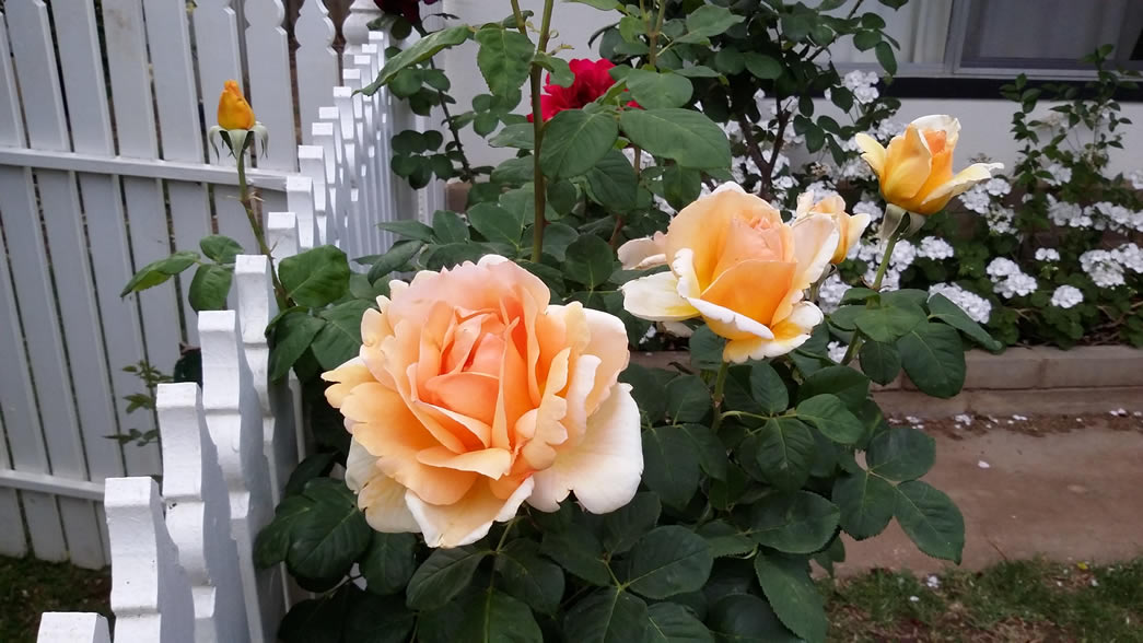
Image Floated left Or Right

We can of course float an image to the left or right of the content. To do this, we simply use the class of left or right in the figure tag. Class="left" is being used in the example image.
This actually does more than simply floating the picture. Have you ever had the experience of a floated image being just a tiny bit too wide when viewed on a mobile, meaning the text is restricted to a very narrow area? Often, that can be lines of one word, all the way down the edge of the picture... very annoying isn't it?
We avoid this problem by having the image reduce in size as the screen size gets smaller (for example, an iPad viewed in portrait). Once we get down to the typical larger smartphone size, we change the floated image to "display block". If you are viewing this page on a laptop, then try reducing the browser width to see this in action.
Opening A Single Image In A Lightbox
While we usually want to use a lightbox for galleries of images, there will be times you want to open a single image in this way. Perhaps you have a diagram picture floated to the left or right of your content, and you need people to see greater detail.
That is no problem, look at the image that accompanies this explanation, and click on it. The image will open up fullsized in a lightbox display.
Here is the HTML used to create this...
<figure class="right">

<a href="images-files/home-feature.jpg"data-lightbox="example" data-title="An example picture title">

<img src="images-files/home-feature.jpg" data-safe-defer-src >

<figcaption> Click to view larger </figcaption>

</figure>
Design is not just what it looks like and feels like. Design is how it works.