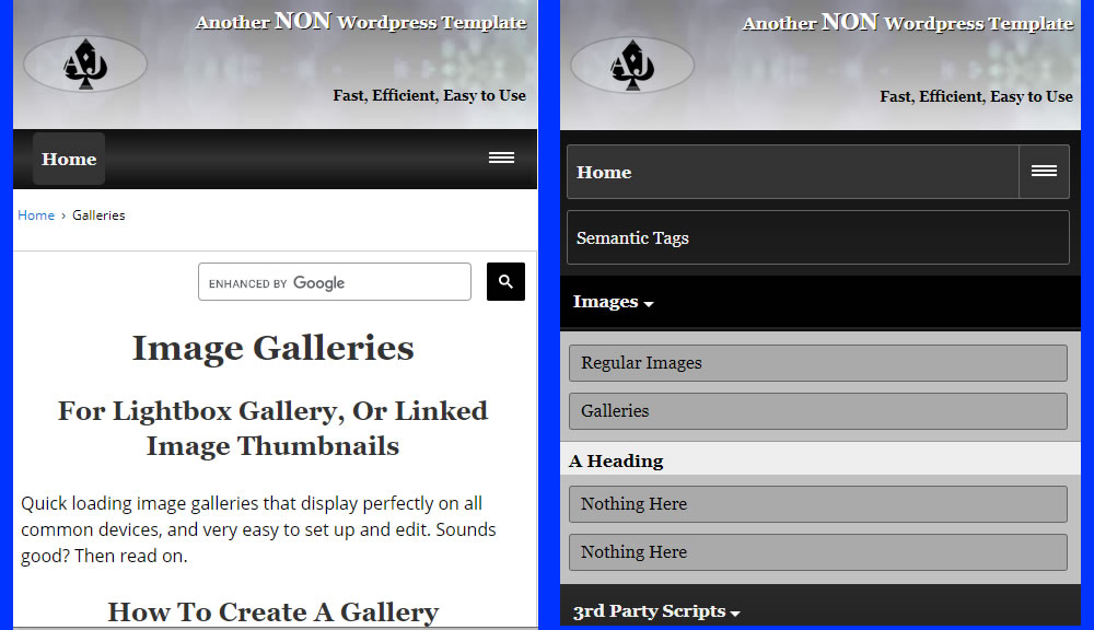
Responsive Menu
A good menu needs to be... responsive and look good on all devices. Accessible, and usable with assistive technology. Easy to edit, uncomplicated html and css. And finally, it needs to be something your site visitors find simple to use.
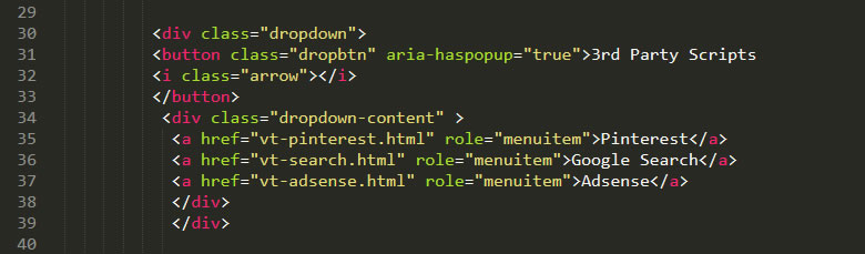
The menu used in this template is loosely based on a menu from the W3C website. W3C menu
However, it has had a number of changes/edits/additions made to it, to give you the menu you can see at the top of this site.
Sticky: This is the first change you will notice. As you scroll down the page (in desktop view, not mobile) the menu will stick to the top of the page. If you don't like this feature, no problem. It can easily be disabled in the stylesheet.
Full Page Width: Whereas the W3C example has a fixed width, this menu will stretch across the full screen width.
Accessibility: The menu has had aria markup added to it, to improve accessibility.
Mobile View: The mobile view has right positioned hambuger icon, with easy to use level nesting of menu items. Fonts, colors paddings etc are all easily editable in the stylesheet.